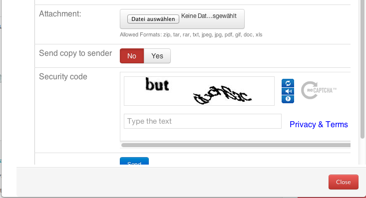
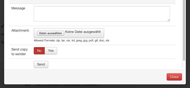
Hello, i think there is a UX/UI issue with bootstrap modals and Cobalt i.e. Comments, Send Mail, Edit forum reply.
- There is no default/standard button location. i.e. sometimes close(x) in top-right corner, sometimes button in footer.
- Cobalt action/button is inside the modal content, thus out-of-sight.
Current examples (mixed appearance):


Question / Suggestion:
Is it possible to have a standard appearance/pattern for Cobalt? And place buttons/actions in modal footer? Maybe always right side with respective color. I am aware of the problem with longer content: It might be an alternative to position the action at the end... and force the user to scroll to the end. But it feels and looks strange to me. Not to metion the average enduser.
Examples of defaults - buttons always in footer area:
BS2 defaults

Misc example

Maybe it is necessary to show both options for close/cancel. I mean (x) and the extra red button in footer. The advantage of the button is a customizable text.
On the other hand, it is also intuitive to offer the (x) only. Users understand it is a sort of a "window" with close icon.
Hello, i think there is a UX/UI issue with bootstrap modals and Cobalt i.e. Comments, Send Mail, Edit forum reply.
Current examples (mixed appearance):
Question / Suggestion:
Is it possible to have a standard appearance/pattern for Cobalt? And place buttons/actions in modal footer? Maybe always right side with respective color. I am aware of the problem with longer content: It might be an alternative to position the action at the end... and force the user to scroll to the end. But it feels and looks strange to me. Not to metion the average enduser.
Examples of defaults - buttons always in footer area:
BS2 defaults

Misc example

Maybe it is necessary to show both options for close/cancel. I mean (x) and the extra red button in footer. The advantage of the button is a customizable text. On the other hand, it is also intuitive to offer the (x) only. Users understand it is a sort of a "window" with close icon.